The vibe of a home can shift completely depending on what colours hit the walls. Paint isn’t just there for show — it’s got the power to shape how a room feels. Some hues can chill things out, others bring a burst of energy, while the wrong ones can kill the mood entirely. Too many folks pick colours based on trends without thinking about how they’ll impact their space. This article explores how house paint colours can make or break the feel of your home — and how to get it right from the jump.
Why do some rooms feel dull even after a fresh paint job?
Rooms feel dull when colour, sheen, and light don’t team up, creating flat surfaces and lifeless corners that undercut ambience. You can repaint and still feel underwhelmed if undertones clash with flooring, window orientation, and furniture textures. Northern light in Australia skews cooler, so blue-grey walls may look dreary; western light hits hard late in the day, so bright whites can glare. Small misfires stack up until the room seems tired, not tidy; when tone and sheen match daylight and materials, things click into gear, too right. Here are the relevant items:
- Choose undertones that echo fixed elements, because clashing floors and benchtops will mute depth and flatten lively textures across the space.
- Balance sheen with texture; higher gloss bounces more light but will amplify surface flaws and create harsher glare in afternoon light that fatigues the eye.
- Map daylight by hour; cool morning light cools colours further, while warm afternoon light can yellow delicate neutrals and skew your palette dramatically.
- Test large swatches at eye level and in corners to see how shadows shift saturation, preventing muddy patches that read dull.
A practical next step is to prioritise durable, consistent finishes that support maintenance and light control. If you need a grounded starting point, explore high-quality paint solutions to align colour, sheen, and substrate so the result feels lively rather than lacklustre.
What mistakes do homeowners make when picking house paint colours?
Homeowners often chase tiny swatches, copy passing trends, and forget how globes skew colour at night, which can turn crisp hues chalky. Another trap is ignoring existing timbers, carpets, and stone; these big surfaces dominate undertones far more than cushions or art. Setting one white for every room also backfires because it shifts from sharp to sterile across the day. Finally, older coatings get overlooked, and that’s when health and longevity issues can sneak in—no dramas until they’re dramas.
- Avoid trend-led picks that ignore orientation; a cool “gallery white” can chill south-facing rooms into a calmer, slower visual rhythm than you intended for high-energy areas.
- Test under your exact lighting; warm LEDs can turn greige walls muddy, while cool LEDs can make beige look pink and slightly metallic across broad surfaces.
- Respect existing finishes; orange timber floors will push blue walls toward teal, which may clash with stone or tile veining in adjoining spaces and hallways.
- Don’t rely on tiny chips; use large, painted samples at eye level to see metamerism under daylight and artificial light before committing across multiple rooms.
To wrap up, treat colour selection as an environmental decision, not a mood board exercise. You’ll dodge headaches and land a palette that behaves well day and night.
Could the wrong house paint colours make your home feel smaller or colder?
Totally — colour mess-ups can shrink a room or make it feel icy, and not in a sleek way. It’s not always about personal taste; it’s about how colour plays with perception. When colour and lighting fight each other, the room ends up losing. Here are the ways paint colour can distort a room’s perception:
- Dark shades in low-ceilinged rooms reduce vertical space, making them feel boxed in.
- Cool tones like steely blues or greys can feel sterile, especially in living areas or bedrooms where you want warmth.
- Using one flat colour throughout a home can make rooms blur together, which feels tighter, not cohesive.
- Incorrect use of contrast between walls and trim disrupts the flow and breaks the visual space.
A better move is using colour to boost natural light and create depth. For tight spots, check out the best paint colour for small rooms to stretch the space visually without going overboard.
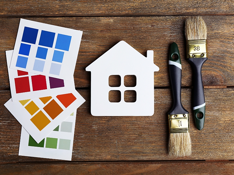
Which house paint colours naturally create a calm and welcoming vibe?
Some colours have a chill factor built in. These are the shades that instantly make a space feel like home — calm, grounded, and easy to be in. You’ll see them a lot in relaxing homes or well-designed Airbnbs for a reason. Here are the house paint colours that promote calm and welcome:
- Muted greens like sage or olive bring nature indoors and help the space feel steady and safe.
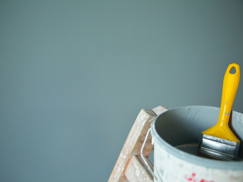
- Soft blues and light greys give off fresh-air vibes, perfect for recharging.
- Warm neutrals such as beige, taupe, and cream feel familiar and comforting, without being boring.
- Peachy and blush tones add a soft, feel-good glow — think sociable, not saccharine.
If your walls used to give you a cosy vibe but now feel flat, it might be time to spot the early warning signs your interior paint is losing colour.
How can house paint colours enhance lighting and visual space?
The right colour can bounce light around and make even a small space feel wide open. It’s all about knowing what works with your windows, fixtures, and finishes. Some tones lift a room; others sink it. Here are the techniques for using paint colours to amplify light and openness:
- Whites with warm undertones bounce natural light effectively and can open up even a tight hallway.
- Using a monochromatic scheme with varying intensities gives flow without monotony.
- Painting ceilings in lighter shades than walls makes the whole place feel taller.
- Glossy or satin finishes reflect more light — a smart trick for windowless rooms.
Here’s a quick guide to how different colours change the feel of a room:
| Colour Tone | Light Reflection | Perceived Space Impact | Ideal Use |
| Soft White | High | Expands room | Small rooms, hallways |
| Pale Blue | Moderate | Calms and opens | Bedrooms, bathrooms |
| Light Taupe | Moderate | Adds warmth, not bulk | Living areas, dining rooms |
| Charcoal Grey | Low | Visually closes space | Accent walls, feature corners |
Lighting and colour are teammates. When they work together, even an average room feels high-end.
Can a professional painter help you select the right house paint colours?
They sure can — and not just with colour cards. A seasoned pro knows how paint behaves in different lighting and spaces. They also know the difference between “that looks great” and “that’s going to last.” Getting it right up front saves big on fixes later. Here are the benefits of working with a professional painter when choosing house paint colours:
- They evaluate natural and artificial lighting effects on the colour before it goes up, not after.
- They understand how paint ages over time, helping you avoid stuff that fades or yellows too fast.
- They align colours with architectural features, not just slapping it on walls without thought.
- They help homeowners avoid tonal clashes, the kind that show up only once it’s too late.
When planning upgrades in older homes, allow for safe prep and substrate assessment, and make time for understanding the effects of lead in household paint so your colour plan aligns with proper ventilation, primers, and long-term performance.
Final thoughts
The colours you live with do more than match your couch — they shape your mood, your energy, and how you feel about your space. Whether you want to chill out, brighten up, or feel more grounded, picking the right paint colours gets you there. If you’re not sure where to start, learn how Mi Painting & Maintenance delivers lasting paint finishes that fit your vision and stand the test of time.