
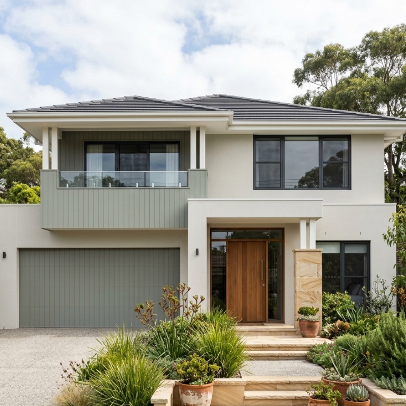
Why Colour Trends Matter
Walk down any Sydney street, and you can pick the houses last painted back in the 2010s. Something about the undertones feels dated. The contrast is a bit timid. And years of salt-laden air have flattened the finish. A repaint is one of those rare chances to lift your kerb appeal and nudge up the resale value in a single hit — so the colour you land on matters more than it ever used to. Our exterior painting specialists see it constantly: the right hue can drag a federation cottage into the present, or take the hard edges off a stark contemporary build. Choose well, and the paint will still look current when the next refresh rolls around. Choose badly and you’ll be itching to start over long before the coating’s actually worn out.
Influences Shaping 2026 Palettes
A few things are nudging Sydney homeowners toward a tighter set of colours this year.
- Climate awareness. Lighter mid-tones that bounce heat back are in again, now that energy bills are biting. The homes on the western fringe, where the summer afternoons hit hardest, got there first.
- Heritage policy. Inner-city councils have been reworking their heritage overlays. The allowed colour ranges still tip their hat to tradition, but there’s room now to slip in a subtle modern accent.
- Paint technology. Manufacturers keep pushing more UV blockers into the pale tints, so chalking and yellowing take longer to show. That confidence in longevity is what’s making people braver with off-white masonry and soft-grey trims.
- Reduced gloss levels. Low-sheen acrylics hide a multitude of surface sins and still hose clean, which suits the older weatherboards that have copped a few Sydney hailstorms.
Five Looks Dominating Sydney Streets
A handful of schemes keep turning up — in colour consults and on freshly painted facades around town. Here’s each look, its swatch, and where it sits best.
| Trend | Sample Hex | Complements | Ideal Home Style |
| Soft Stone Neutrals | #DAD5CE | Terracotta pots, native landscaping | Mid-century brick veneers |
| Moody Green-Grey | #596861 | Matte black hardware, copper gutters | Federation terraces |
| Warm White on White | #F5F2EE | Blonde timber decks, brass lighting | Coastal new builds |
| Charcoal with Clay Trim | #3C3C3E | Rust-toned planters, sandstone walls | Modernist boxes |
| Subtle Peach Undertone | #EFDAD0 | Aged brass fixtures, cream fences | 1920s bungalows |
Soft Stone Neutrals
Picture muted limestone, not an icy grey. It reads as organic next to native plantings and takes the harshness off big runs of brick. Give it a satin finish and the colour deepens at sunset, which adds a bit of depth to an otherwise plain facade.
Moody Green-Grey
Deeper than the eucalyptus tones everyone was using a few years ago, this one sits beautifully against wrought-iron lacework and aged copper. The move right now is a matte, almost chalky finish — it keeps the whole thing looking considered rather than military.
Warm White on White
Beachside owners still can’t resist a crisp white box. But 2026 softens it — a creamier base and trim contrast you can barely make out. Easier on the eye, and it glares far less under that sharp coastal sun.
Charcoal with Clay Trim
Dark walls with a thin red-brown edge line give you drama without going full monochrome. The trick is to pull that trim colour straight from the recycled brick or the terracotta roof tiles already on the house.
Subtle Peach Undertone
Peach frightens off the first-timers, but just a whisper of it lifts weatherboards that used to fall flat in a clean grey. The warmth catches the ornate gable vents, and it works a treat alongside federation leadlight.
Matching Colour to Suburbs and Materials
Trends never beat site logic, though. A shade that’s spot-on in Bondi can die in Baulkham Hills, where the light’s warmer and the street’s a lot greener. Two quick checks save you the regret:
Light quality. The eastern suburbs soak up cooler ocean light — whites go bluer, charcoals turn steely. Head inland, and that exact same sample leans yellow. Always test it on the facade that cops the peak sun.
Surface texture. Bag-rendered brick throws light back differently than smooth weatherboard. Dark tones on a rough surface can swallow the detail and leave the house looking like one solid lump. Go the other way — light tones on ripple iron — and you’ll see every ripple and every fastener. Once you’ve settled on a palette, get sample pots and roll at least a square metre of each finish.
For more on nailing the timing, our article on how long exterior paint lasts in Sydney gets into how humidity and dew point mess with paint performance — and why those two keep tripping up DIY jobs.
Making a Confident Choice
Instead of chasing every new hue, pin the decision to three things: the architecture, the street around it, and what you’re realistically willing to maintain. A federation semi usually earns its keep with a body colour a couple of steps lighter than the roof. A coastal duplex might do the opposite — one tone straight across the walls and fascia, to make the whole thing read wider.
Sample boards earn their place, but the jump from an A4 card to a two-storey wall is enormous. Paint it at scale on a lower section of wall, live with it through morning and late-afternoon sun, and get honest feedback from a neighbour whose eye you actually trust.
And if you’re torn between a deep charcoal and an earthy green, don’t forget the darker one drinks up more heat. That can mean the expansion joints, the caulking and the timber all want a bit more attention. The Australian Government’s guide on paint finishes lays out how colour plays into thermal performance — worth a look if energy use is high on your list.
Sydney’s 2026 palettes make one thing clear: fresh doesn’t have to mean flashy. The drift toward natural warmth and low-glare finishes is helping homes feel current without chaining owners to a fad. For most places, a timeless neutral on the body with a confident, slightly deeper trim lands right in that sweet spot between modern and classic — which is exactly where buyers and valuers like to see it.

